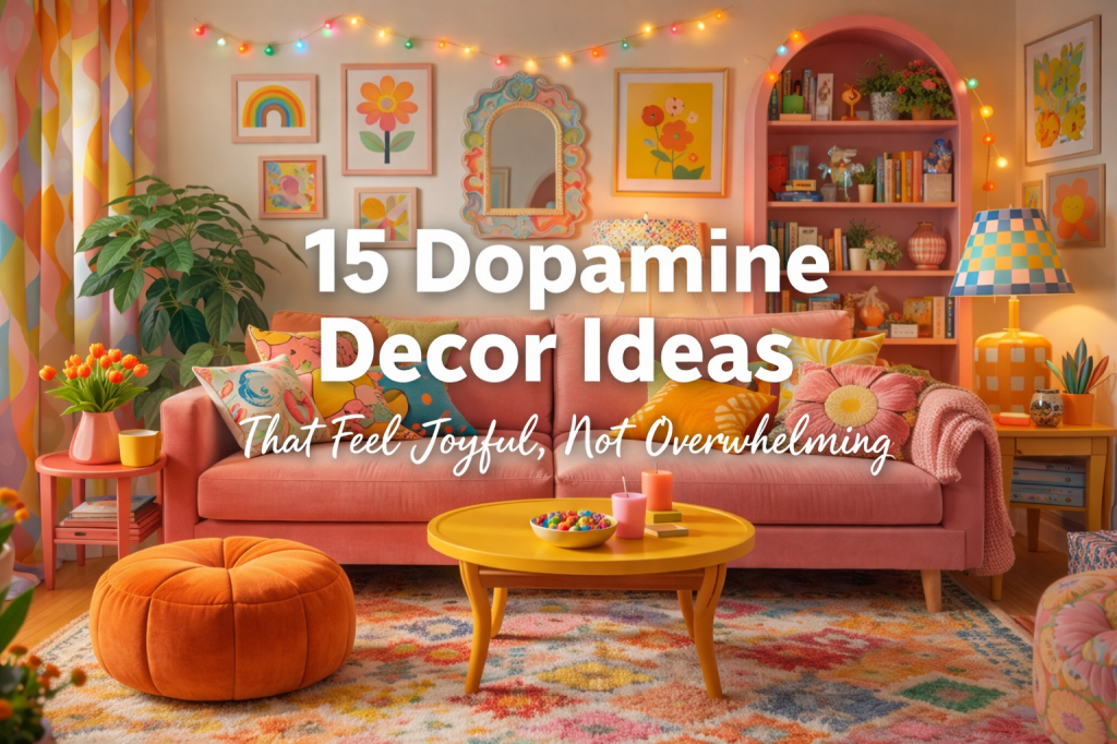
Dopamine decor is about creating spaces that feel joyful, comforting, and energizing to live in. The rooms that work best are colorful and expressive, but they are not chaotic. They feel intentional, cohesive, and personal.
What makes dopamine decor successful isn’t using more color.
It’s using color thoughtfully.
The Dopamine Decor Color Rule (A Helpful Guide, Not a Law)
Most dopamine decor rooms use roughly three to five colors, often within the same color family, and repeat them throughout the space.
Common combinations include:
Pink, coral, cream, and soft red
Teal, turquoise, mustard, and warm wood
Pastel pink, mint, lavender, and white
Peach, butter yellow, sage, and light oak
Pastels tend to allow for more flexibility because they blend naturally. Brighter palettes usually stay a bit tighter. This is not a strict rule, but a guide that helps bold color feel cohesive instead of overwhelming.

1. Use Rugs to Introduce Two or Three Colors, Not the Whole Palette
A rug does not need to contain every color in your room. In many dopamine decor spaces, the rug introduces just two or three key colors. Those colors are then repeated in pillows, art, furniture, or accessories elsewhere. The rug starts the color story, it doesn’t have to finish it.

2. Keep Your Sofa and Change the Surroundings
Replacing furniture is not always realistic. Many dopamine decor rooms keep neutral sofas and transform them with color around and on top of them. Slipcovers in palette colors, textured throws, and bold pillows can visually pull an existing sofa into the color plan without replacing it. The surrounding decor often does more work than the furniture itself.

3. Build Color Through Art Instead of Paint
Colorful walls are common, but paint is not required. Art often carries the color load in dopamine decor spaces. Gallery walls repeat the same few colors across prints, frames, and mats, creating visual impact without permanent changes. This approach works especially well in rentals.

4. Repeat Colors Across Different Textures
Repeating a color in multiple materials keeps a room from feeling flat. The same shade might appear in velvet upholstery, ceramic decor, painted wood, and soft textiles. Texture variation adds depth while color repetition maintains cohesion.

5. Use Warm, Ambient Lighting Instead of Overhead Lights
Lighting in dopamine decor spaces is warm and soft rather than flashy. Harsh overhead lighting is often avoided. Instead, rooms rely on table lamps, floor lamps, and sculptural lamps that create an ambient glow. Amber-toned bulbs are common, adding warmth without overpowering the space. Sculptural lamps, including lotus-style lamps, appear frequently because they combine warmth, texture, and visual interest.

6. Let Mirrors Add Color and Shape
Mirrors are often part of the decor rather than disappearing into the background. Wavy silhouettes, scalloped edges, and colorful frames add shape and reinforce the palette while reflecting light around the room.
7. Mix Patterns That Share a Color Family
Pattern mixing is common in dopamine decor, but it works because the colors stay related. Stripes, florals, checks, and abstract prints can coexist when they pull from the same palette or color family. Pastel-based rooms often stretch this further because the tones blend naturally.

8. Use Decor Objects to Reinforce Color
Smaller decor pieces quietly repeat the palette throughout the room. Vases, trays, books, planters, and sculptural objects are chosen for how well they echo existing colors rather than introducing new ones. This repetition builds cohesion without clutter.

9. Painted Furniture Is Optional, Not Required
Painted cabinets and furniture appear often, but they are not mandatory. Similar impact can be achieved with removable elements such as shelf liners, peel-and-stick wallpaper on furniture backs, or decor grouped by color. Commitment is optional, cohesion is not.

10. Start With One Small Space
Dopamine decor does not need to take over an entire home. Many people start with a smaller area, such as a reading nook, hallway bathroom, or bedroom corner. Smaller spaces make it easier to experiment with color and decide whether the style feels right before expanding further.

11. Let Neutrals Support the Color
Neutrals play a supporting role, not an opposing one. Creams, whites, light wood tones, and soft grays appear frequently, especially in rentals. They provide breathing room and allow brighter colors to stand out without overwhelming the space.

12. Repeat One Color More Than the Others
Even in rooms with several colors, one shade usually appears most often. This might be pink, teal, yellow, or another palette color. Repeating one color across furniture, art, and decor gives the eye a consistent anchor and helps the space feel balanced.

13. Edit Before Adding More
Successful dopamine decor rooms are edited, not crowded. If an item does not fit the color family or overall mood, it is often removed rather than worked around. Editing keeps bold spaces feeling intentional instead of overwhelming.

14. Keep Whimsical Pieces Inside the Color Plan
Playful decor elements feel elevated when they stay within the established palette. Sculptural objects and novelty accents work best when they reinforce the color story rather than competing with it.

15. Let the Space Settle Before Changing It
Once colors repeat naturally and the room feels balanced, it helps to pause and live with the space. Dopamine decor is about long term enjoyment, not constant adjustment. A room that feels good day after day is doing its job.